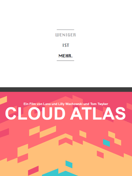
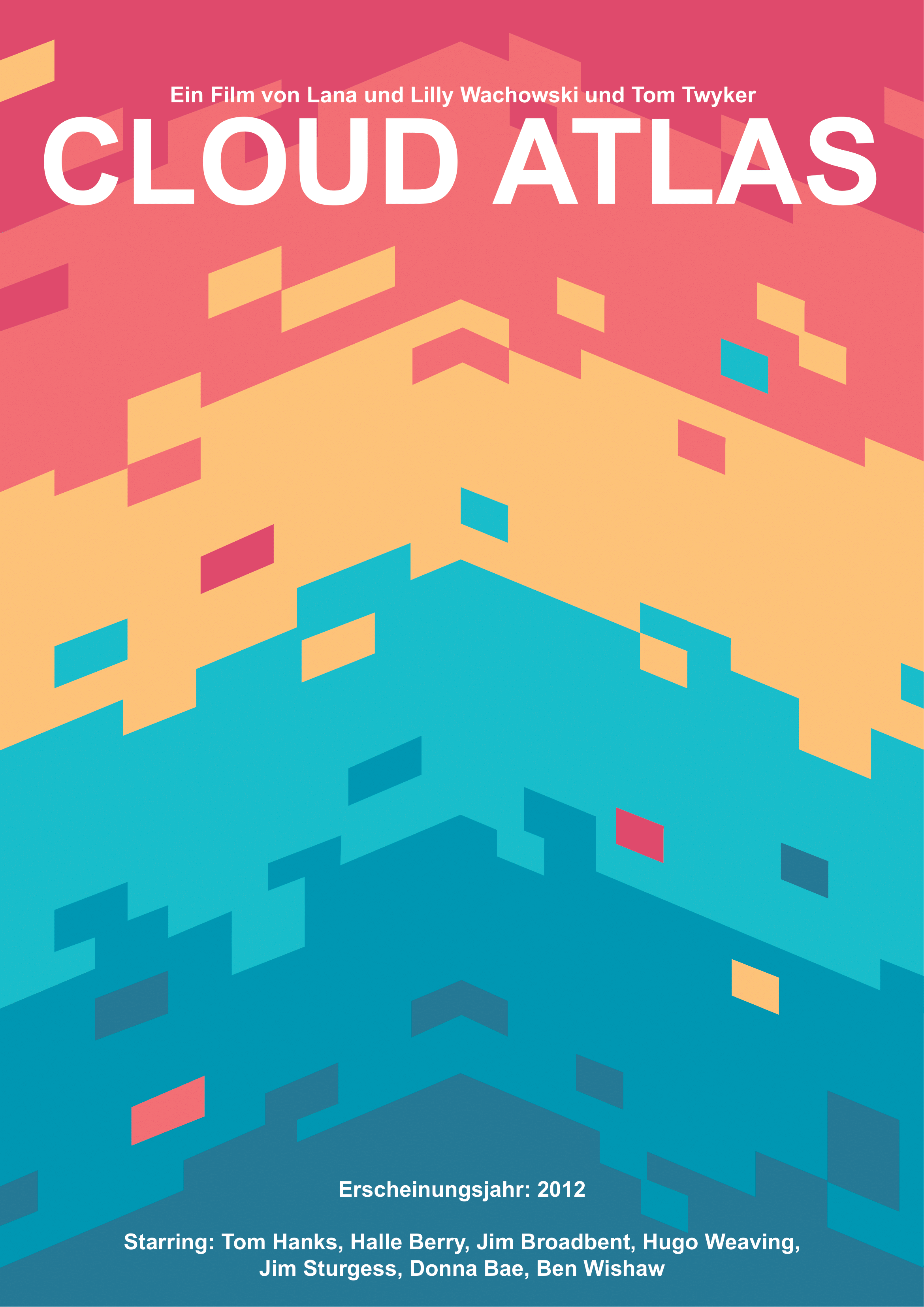
ABSTRACT DESIGN

In the first semester of my Media Informatics degree, I learned basic design principles and poster design in the Media Design 1 course.

The assignment for this subject was to design posters using Adobe InDesign. The posters were to be created with abstract designs, i.e. without clearly recognizable objects or symbols.

Thus, the challenge was to create a feeling using only simple design options such as colors, geometric shapes and composition to convey a feeling.

The first poster is about my favorite movie, Cloud Atlas. There, several storylines from different eras flow into each other, so I also let the colors “flow into each other”.

The strong warm-cold contrast thus also represents the movie's concept that every crime and act of kindness originate far in the past and continue to have an impact far into the future. This connection between good and evil is also be portrayed in this way.

The second poster is about a quote from the architect Mies van der Rohe, “Less is more”.

I tried to approach this quote through the design by choosing a very light and minimalist design. There is also a contrast here between light and dark: the word “more” is darker than the word “less”.